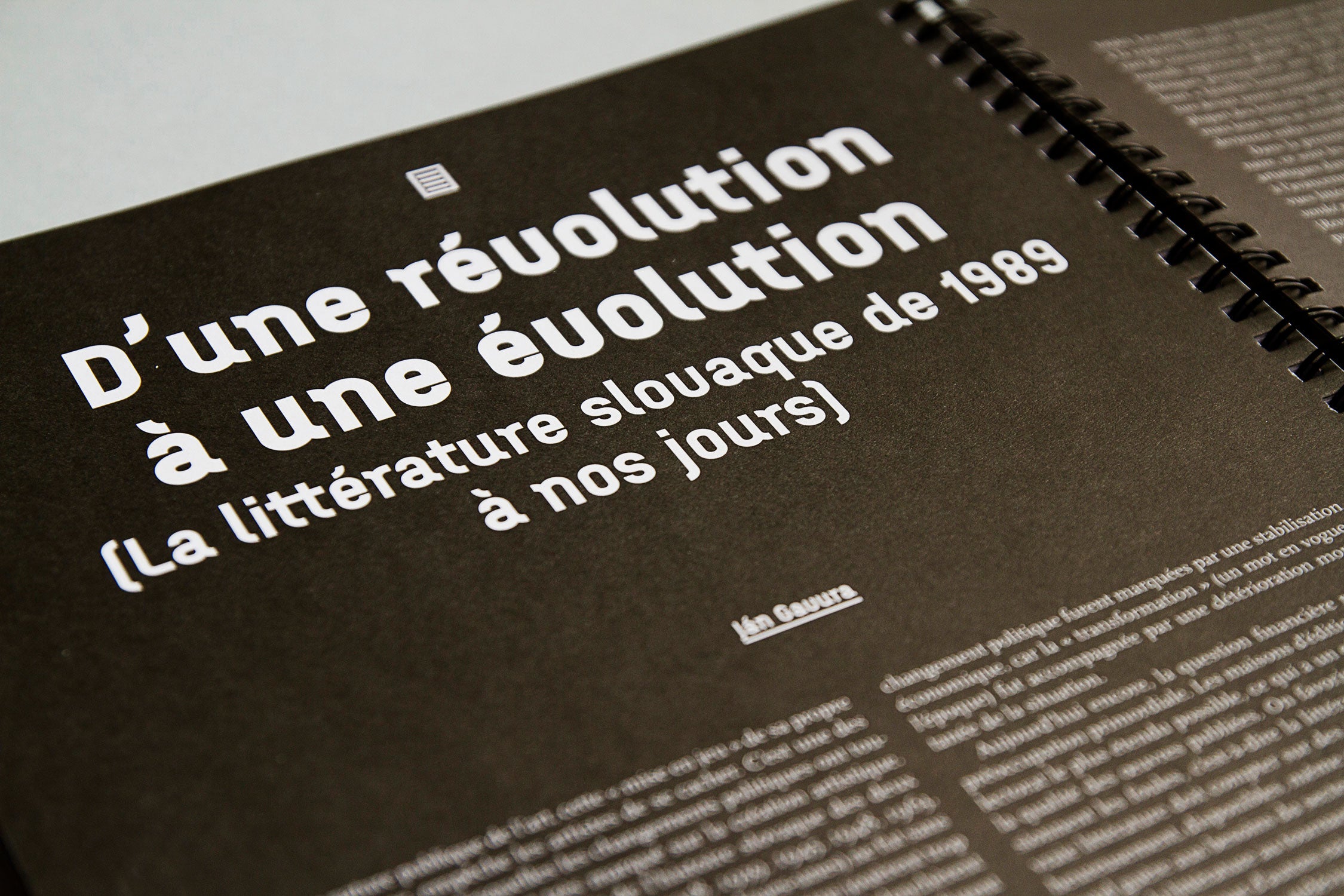
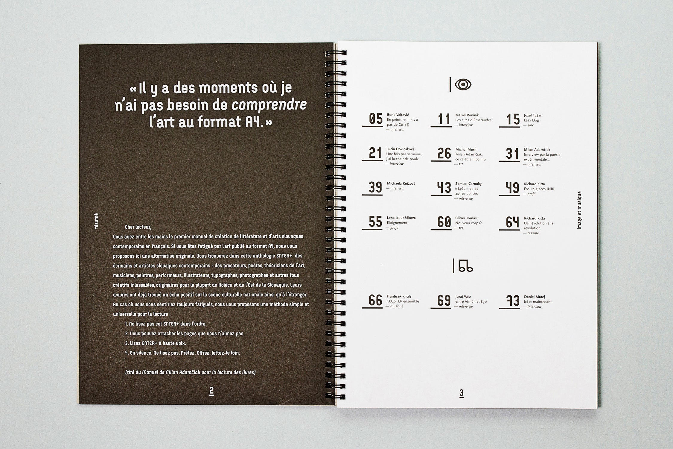
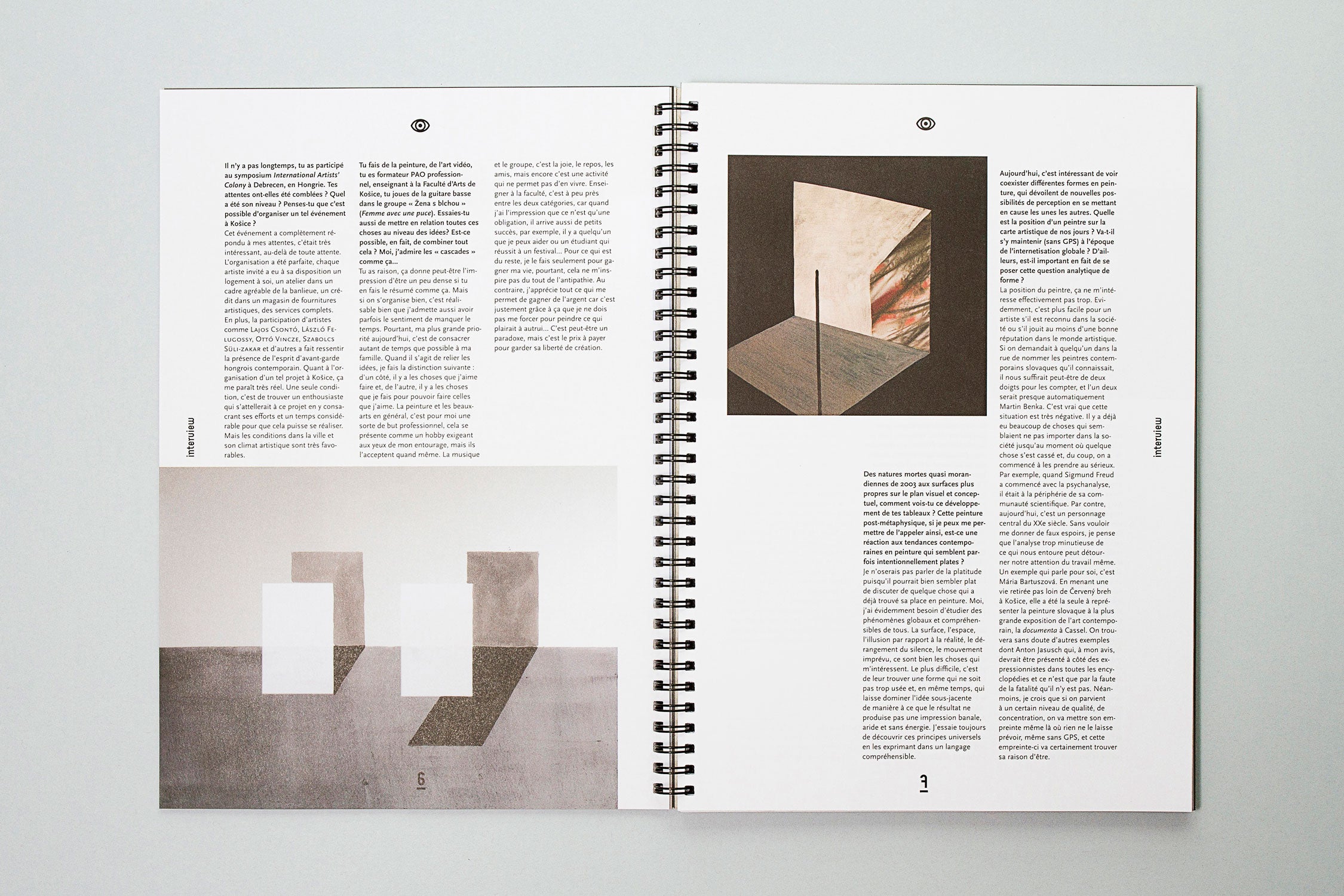
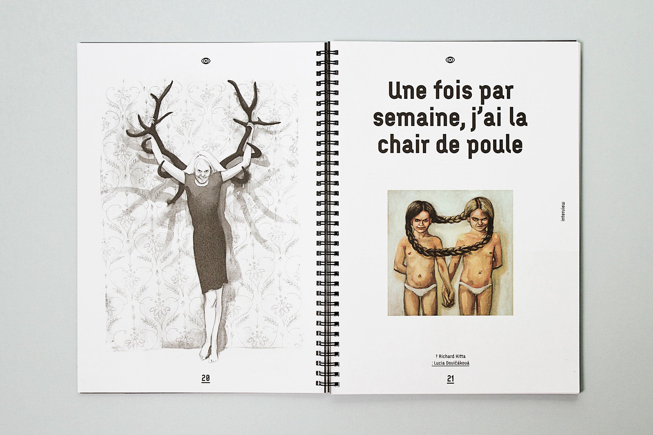
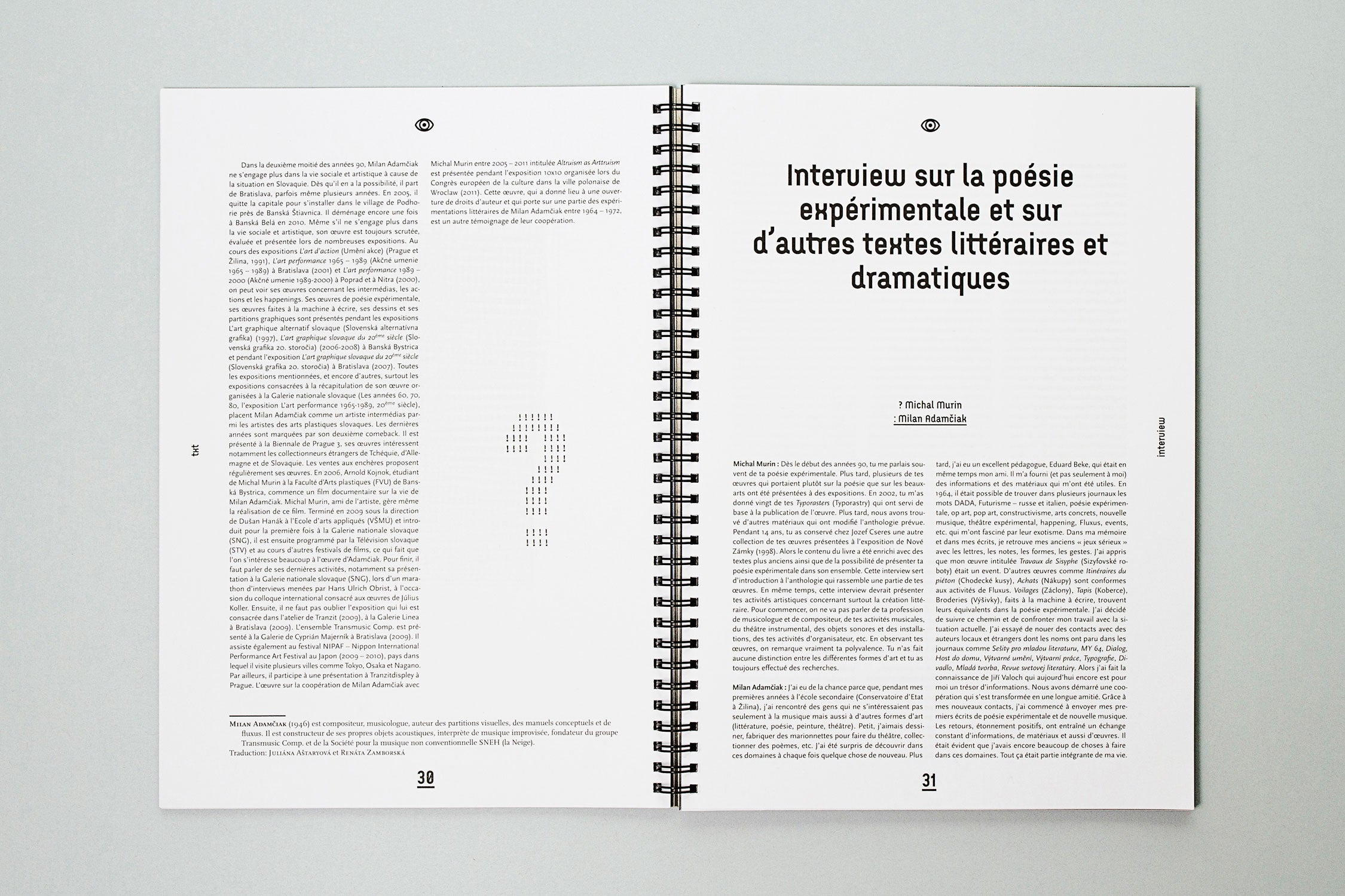
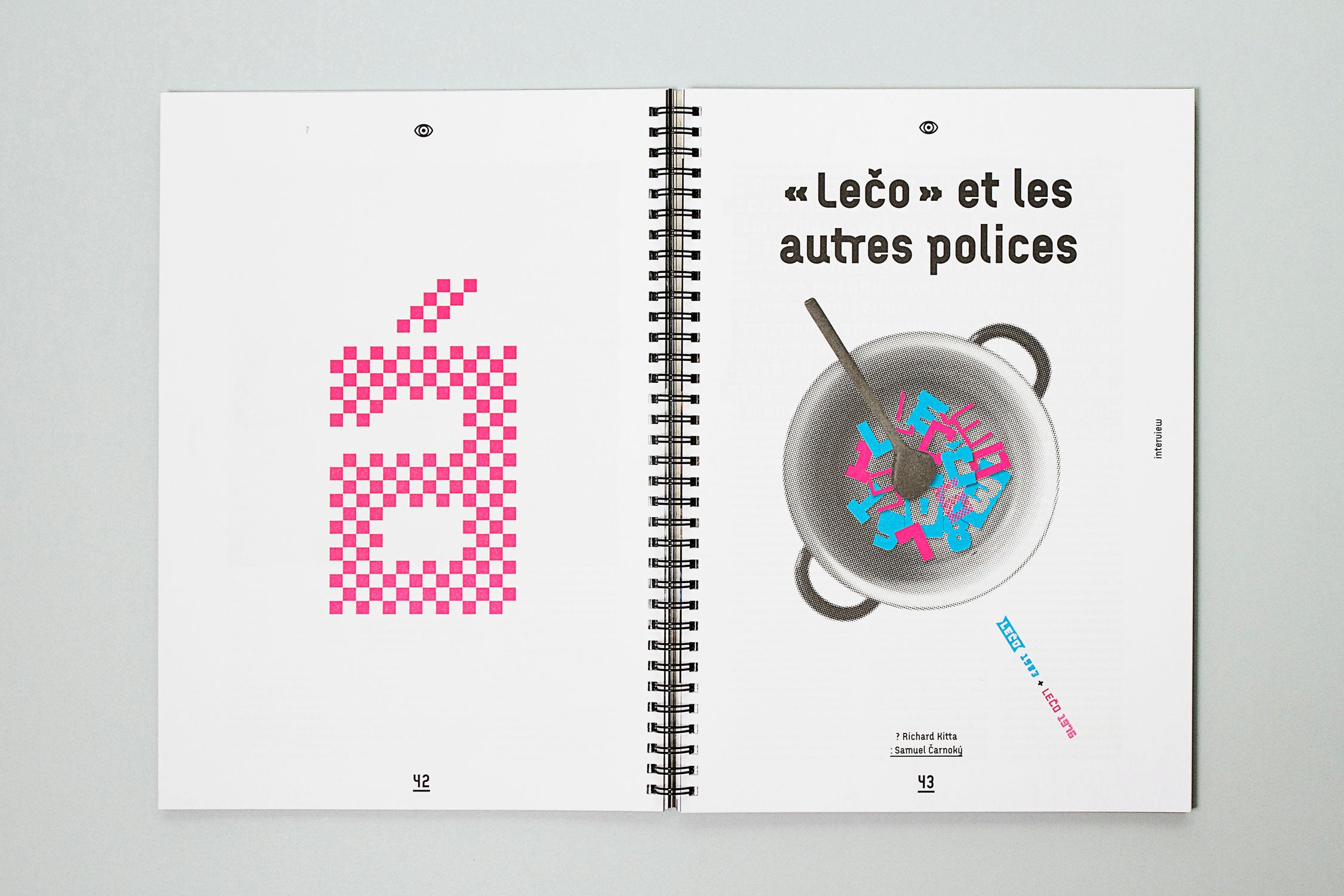
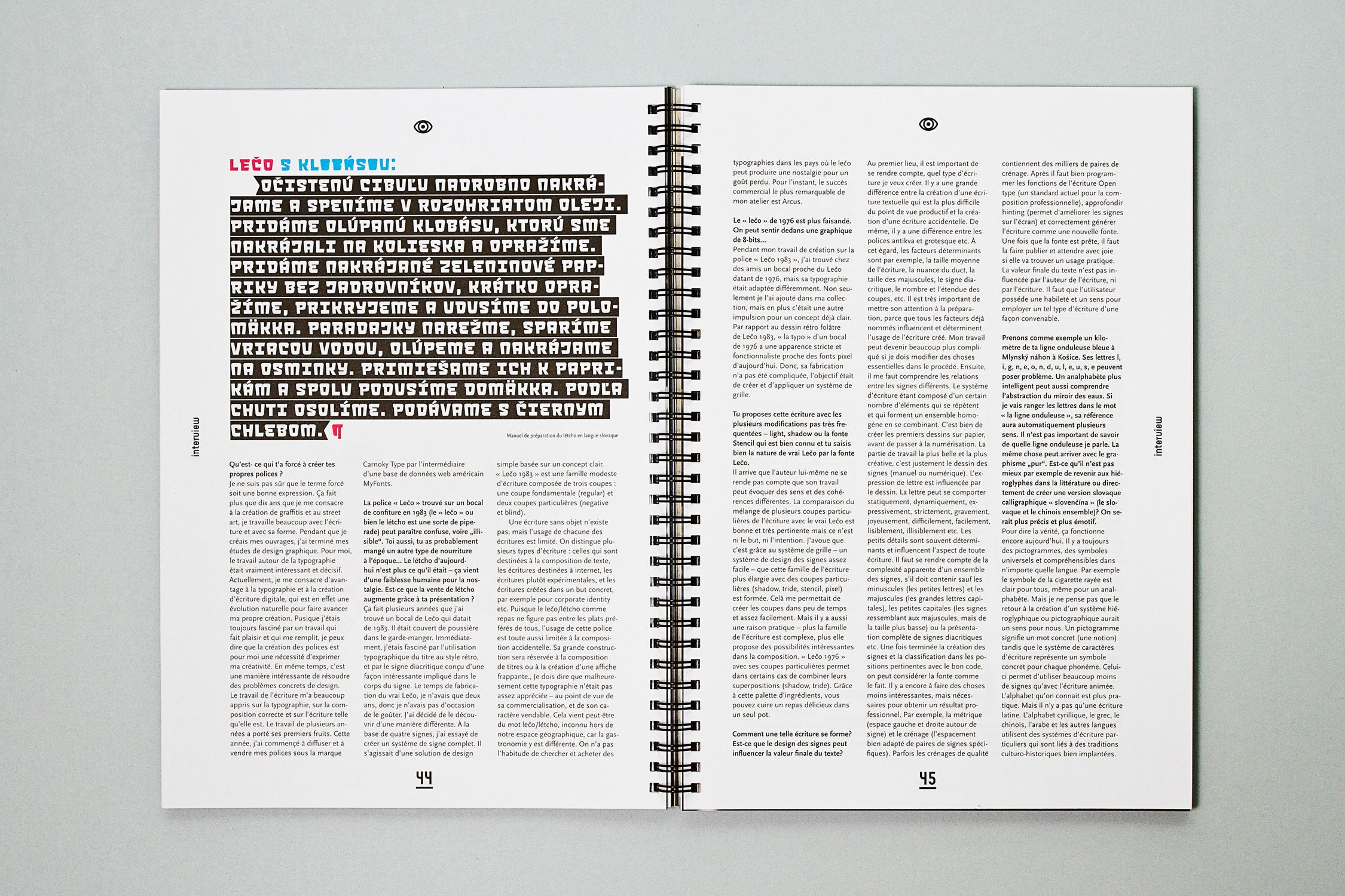
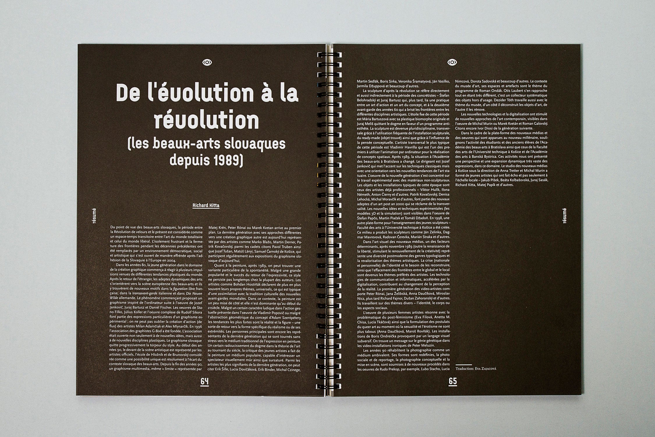
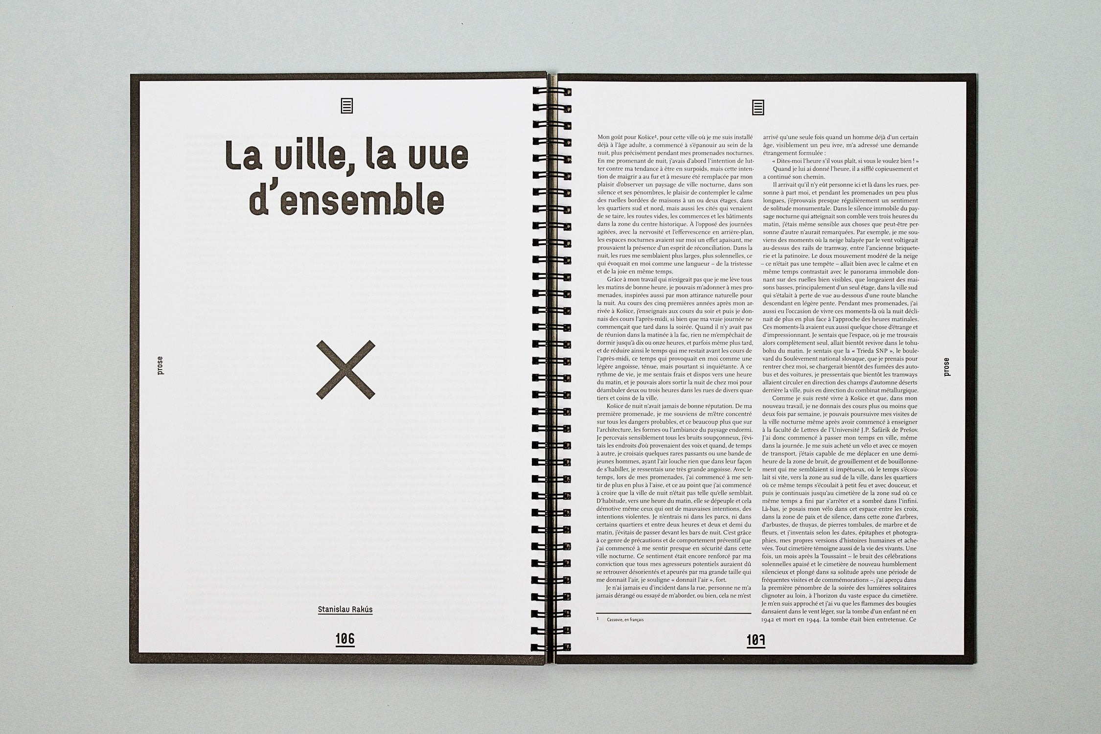
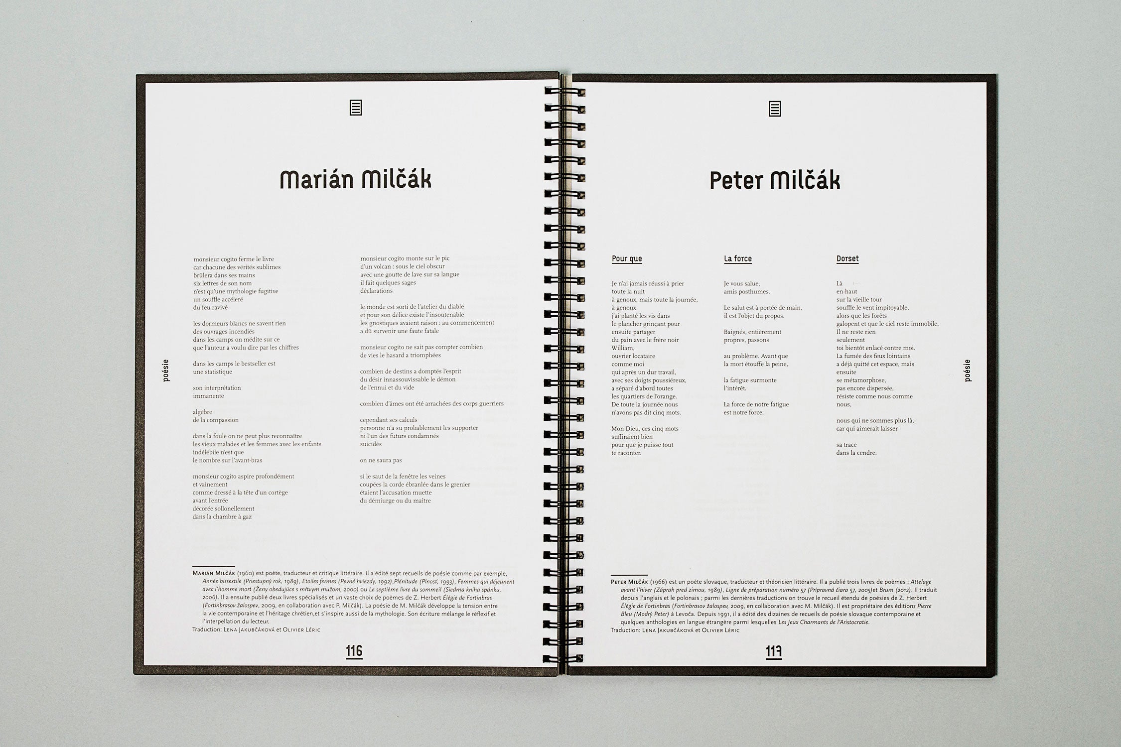
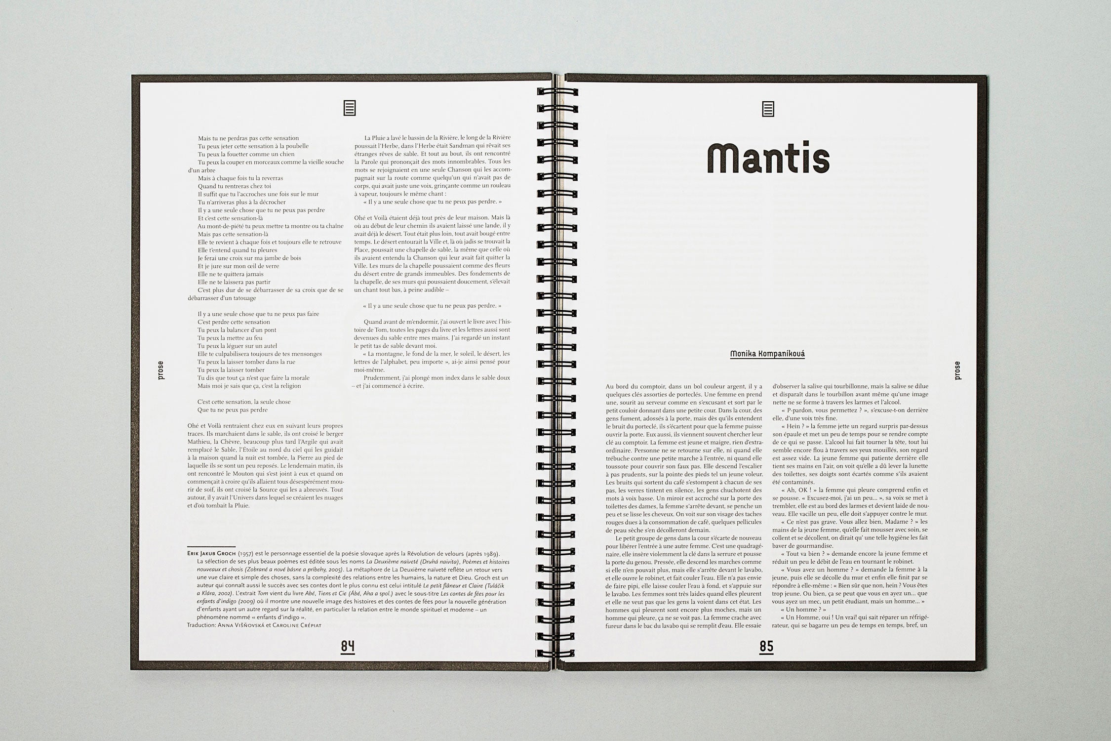
ENTER magazine focuses on current local and global art and literature. The layout concept and graphic design was created in cooperation with Martin Groch and had remained in the same form for quite some time. It follows the design of previous issues, from which it took its format and the type of spiral binding. The layout and typography were completely changed. The texts are made up according to the type of articles (interviews, articles, literary pieces, etc). The clarity of layout is complemented by navigation and infographics at the margins. The bold headlines in local display typeface, Argus, add authenticity to the design. The presented issue, Edition Spéciale, is a special issue aimed at French speaking readers.
ENTER magazine • Edition spéciale •
Wire-O binding • 210 × 297 × 12 mm •
128 pages • typefaces:
Arcus / Scala & Scala Sans •
layout: Martin Groch & Samuel Čarnoký •
published by: Dive Buki, Košice 2012 •
design: © Samuel Čarnoký (2012)
Selected in: Top Graphics design series:
Brochure & Layout; Hightone Book 2013,
p. 57–58
Photo credits: Michaela Eliáš
Instagram • Facebook • Behance • Dribbble
