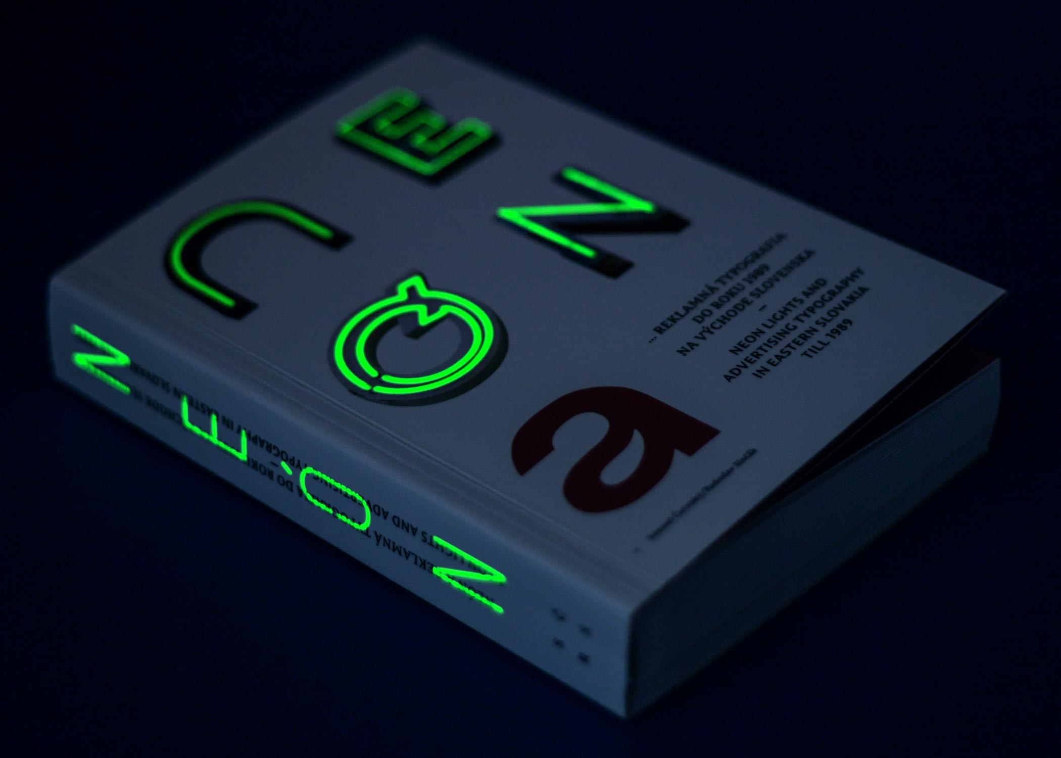
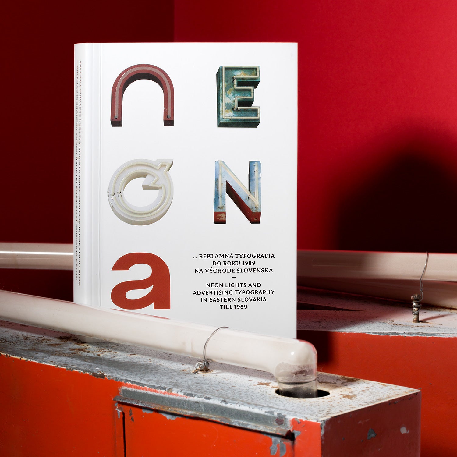
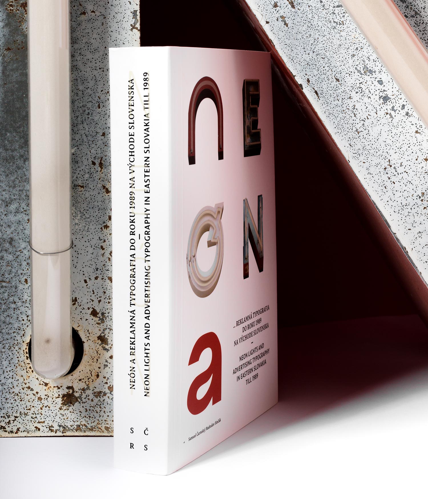
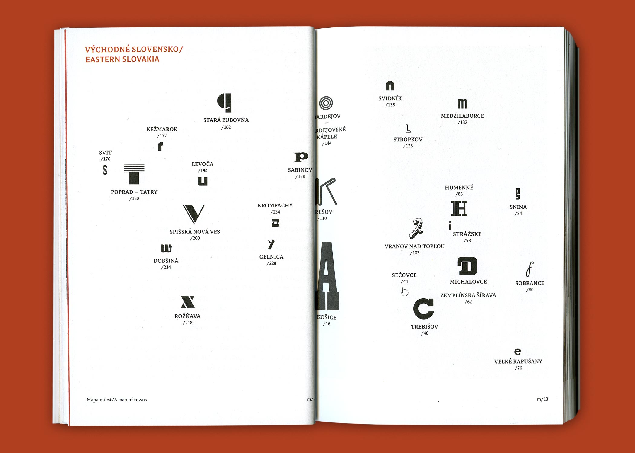
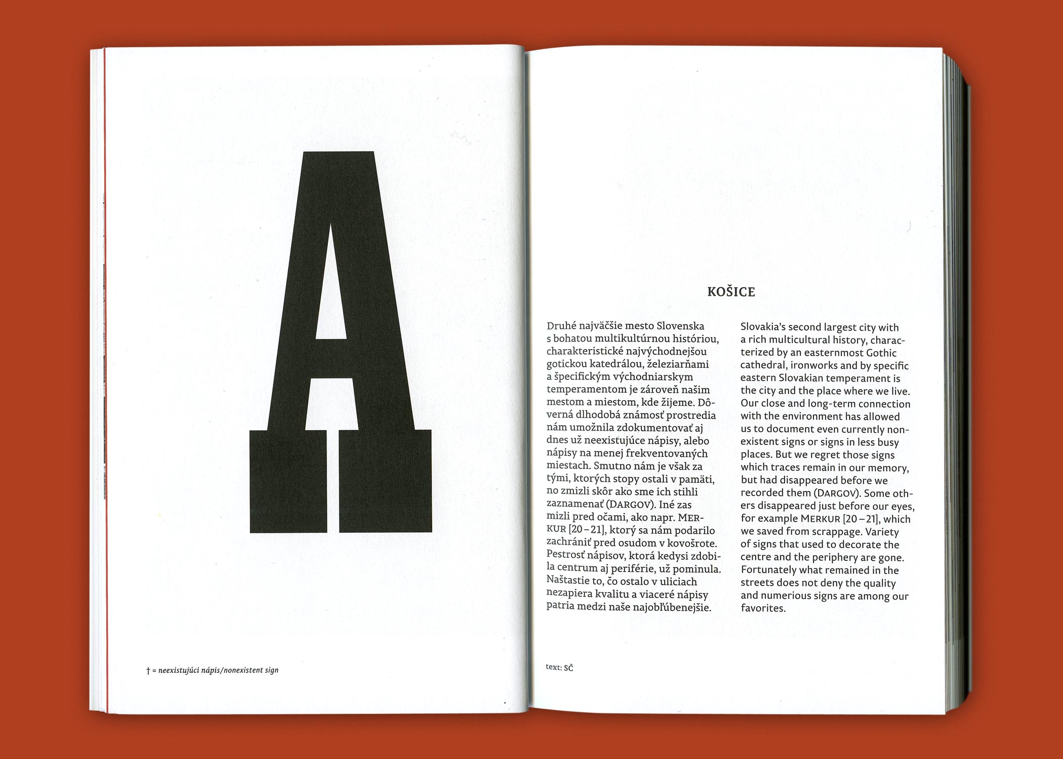
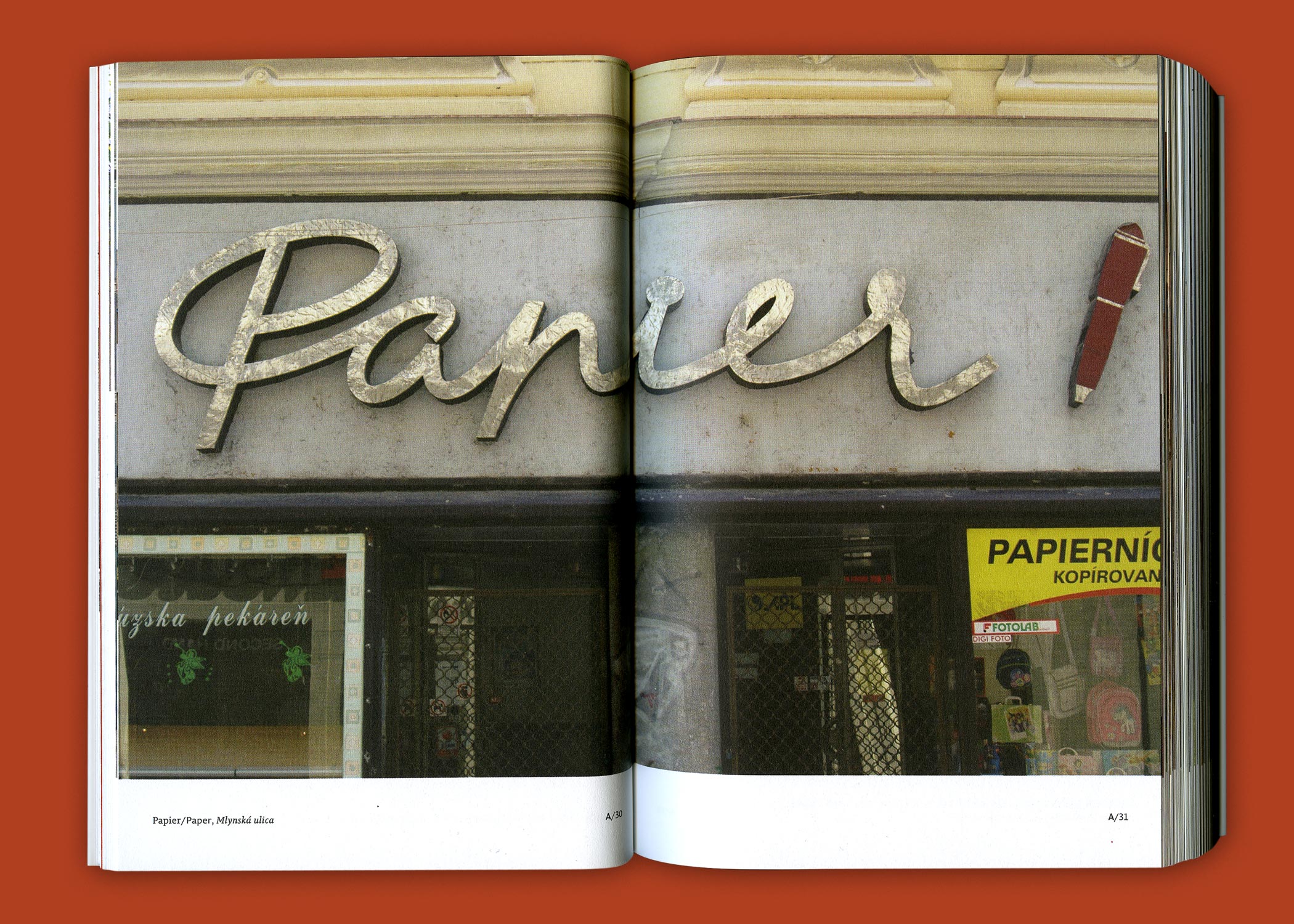
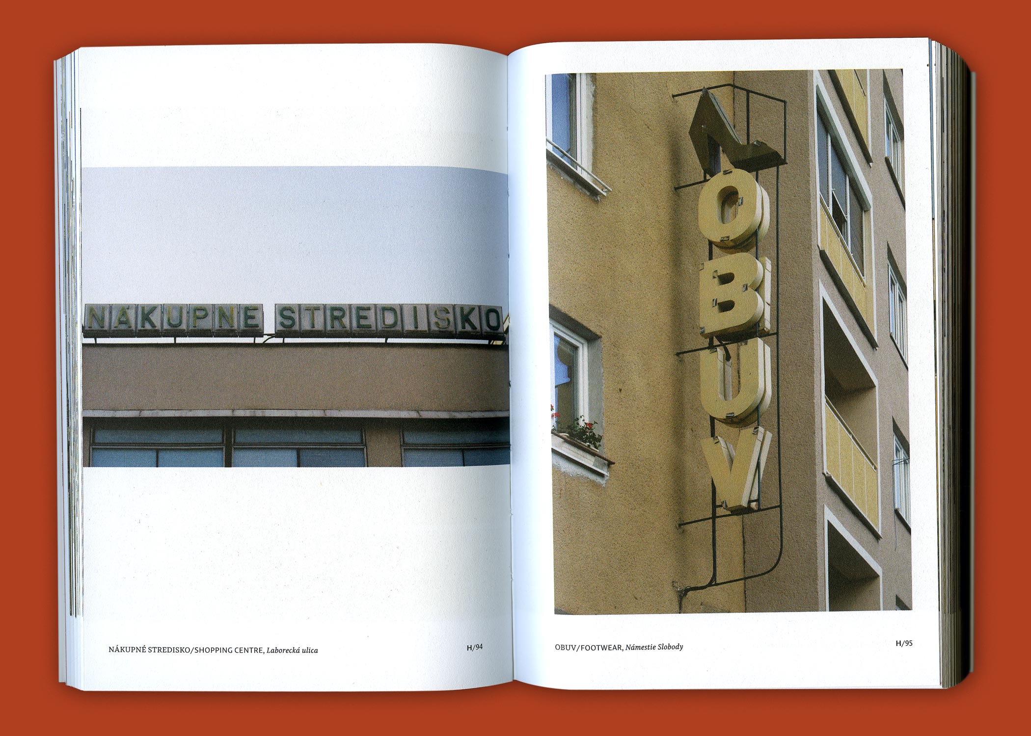
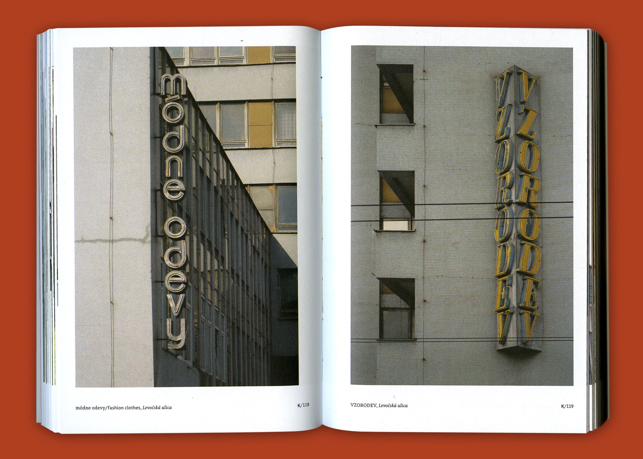
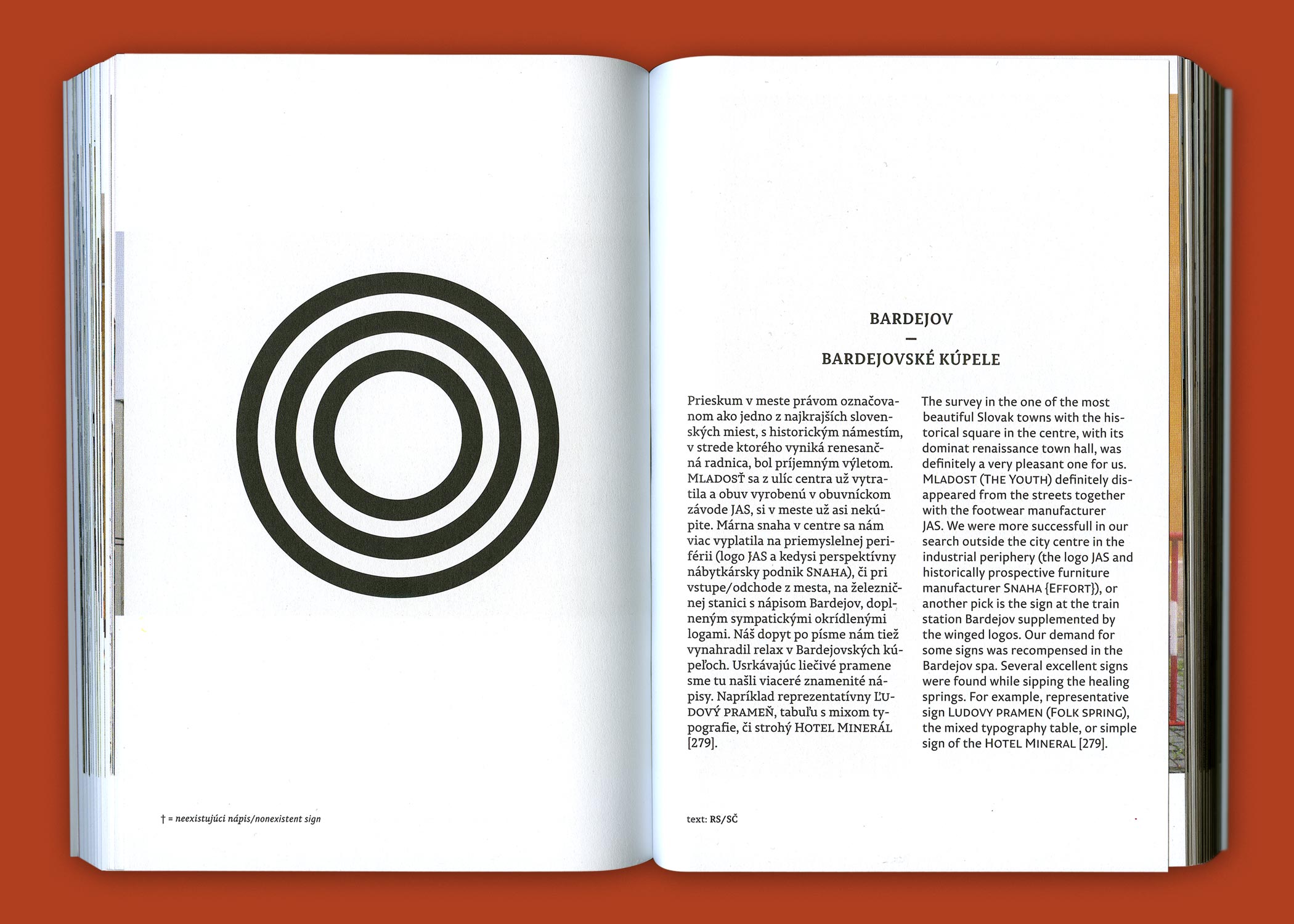
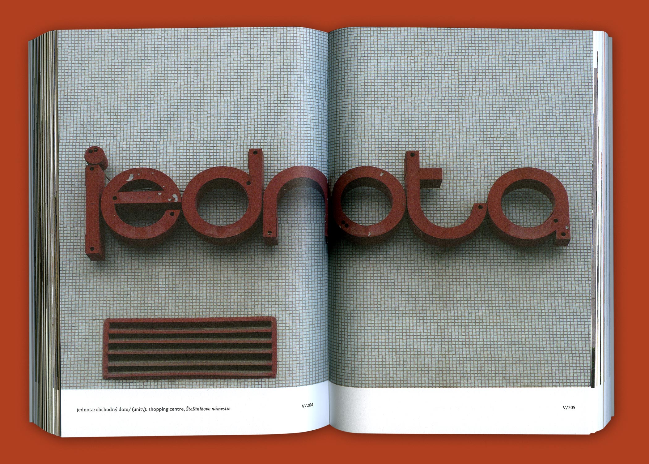
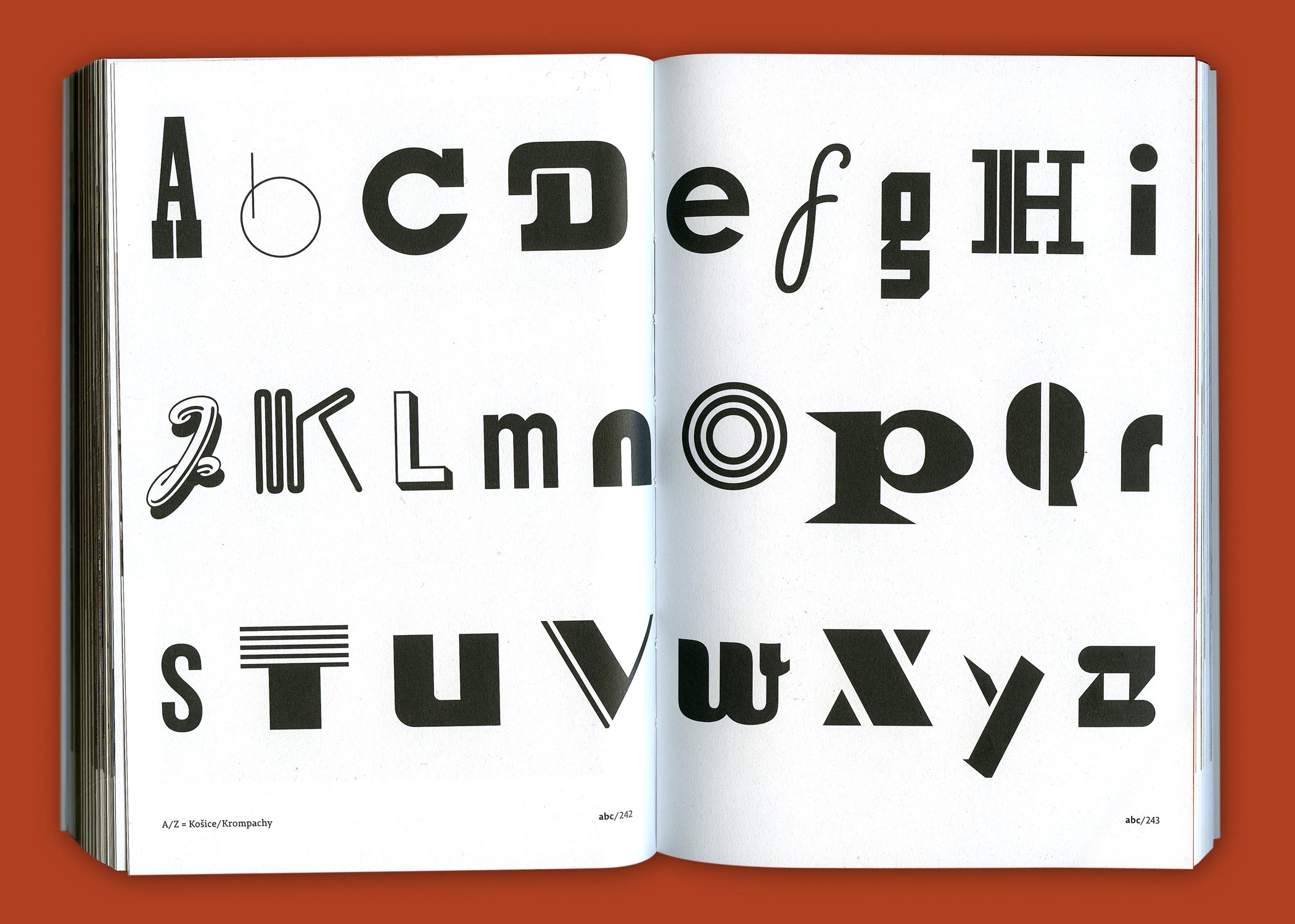
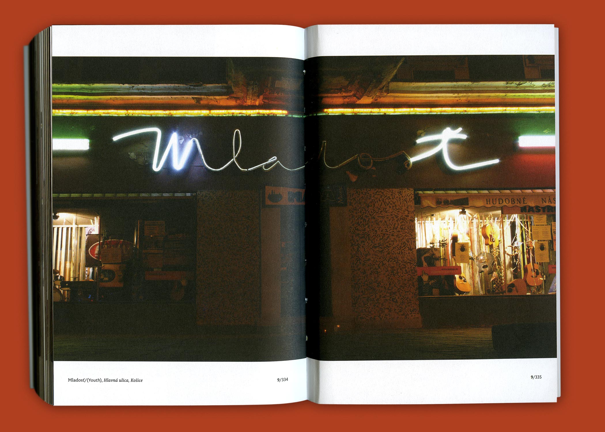
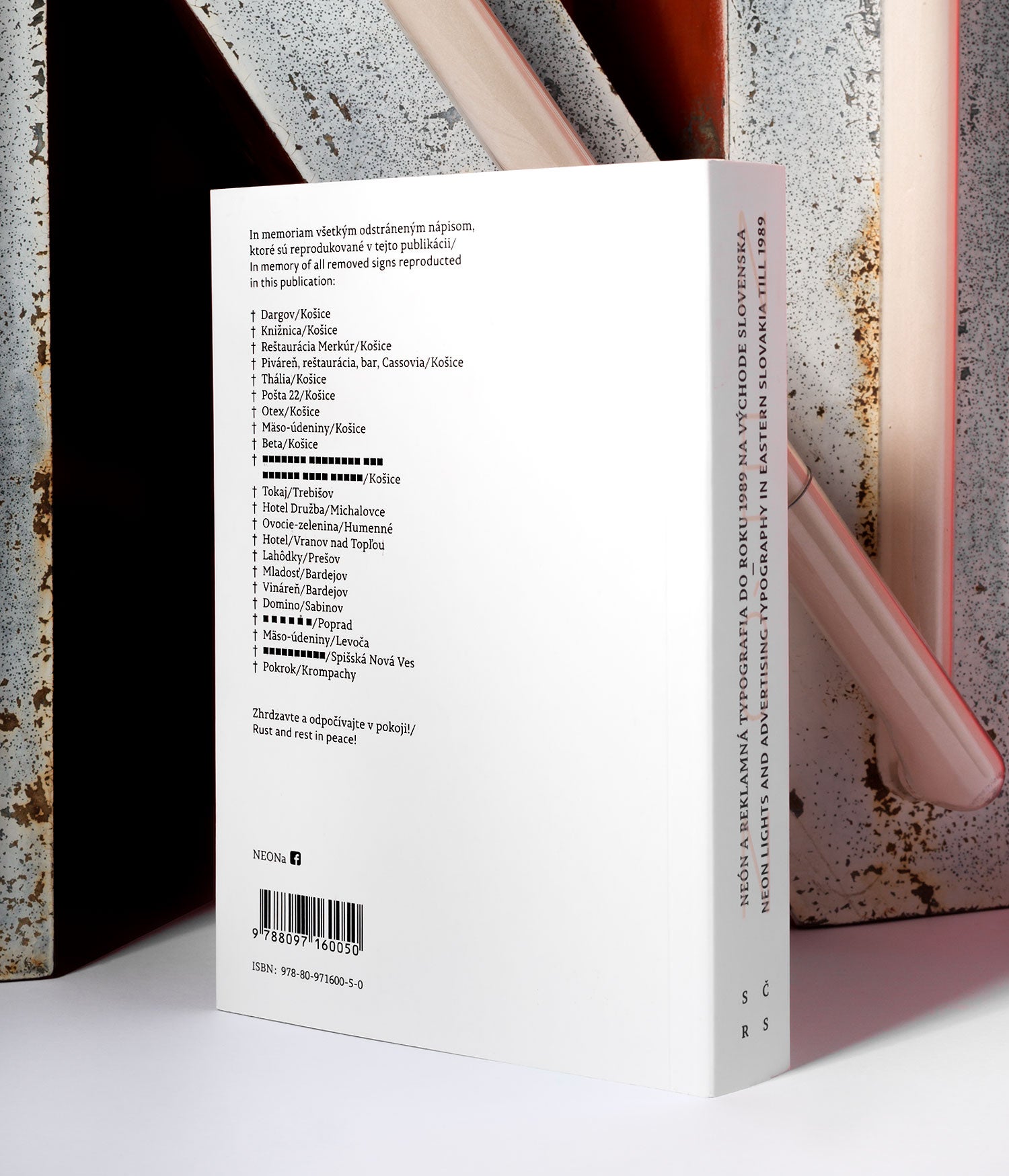
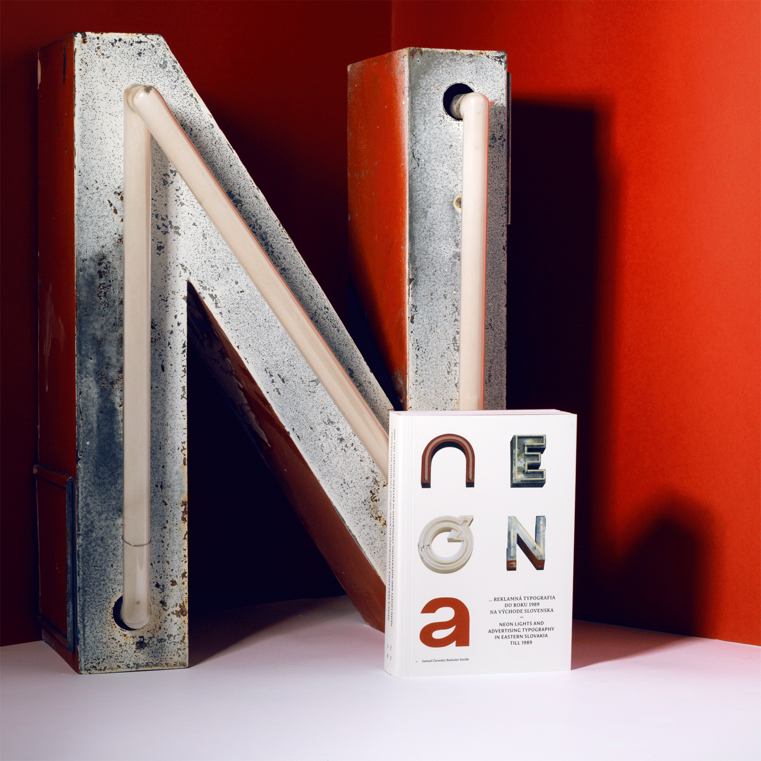
A documentary publication mapping nostalgic and disappearing neons and advertising signs from the past (cold war period) in towns of eastern Slovakia. a visual research from 26 towns (symbolically corresponding to the 26 letters of the alphabet), completed by authors’ subjective conclusions. The interests of authors were combined by their personal relationships to typefaces and public spaces from the perspective of an architect and a graphic designer.
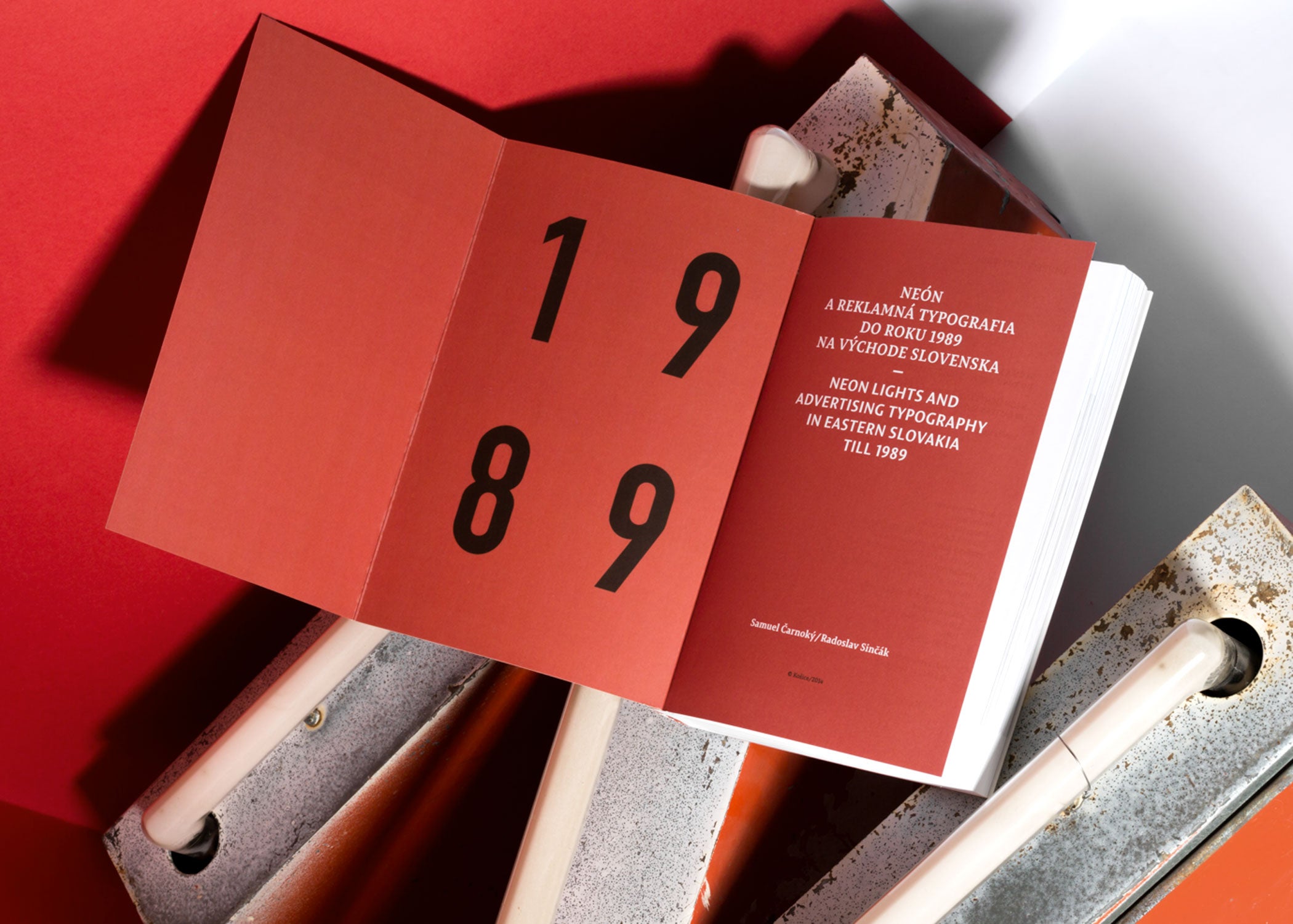
Samuel Čarnoký / Radoslav Sinčák:
Neon lights and advertising typography
in estern Slovakia till 1989 •
paperback — Otabind • 125 × 185 × 28 mm •
336 pages • offset / phosphor print •
published by: Samuel Čarnoký, Košice 2014 •
design: © Samuel Čarnoký (2014)
Published in: 365 Typo: 365 stories
on type, typography and graphic design;
étapes: editions 2015, p. 269
Photo credits: Diana Dobrescu and author
Instagram • Facebook • Behance • Dribbble